Johns Hopkins Breast and Ovarian Family Cohort
Date: 2015
Logo
![]()
Project: Logo Design for the Johns Hopkins Breast & Ovarian Family Cohort
Medium: Online
Applications: Adobe Illustrator
Website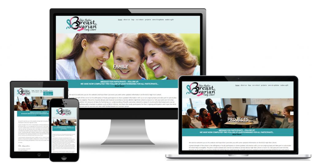
Project: Website for the Johns Hopkins Breast & Ovarian Family Cohort
Medium: Online
Format: Responsive design
Applications: Adobe Illustrator, Adobe Photoshop, WordPress template (customized)
Description: The site’s main objective to create a logo and website was to provide information on the cohort and project and update visitors and the cohort with progress, accomplishments and activities as well as give the cohort a platform to communicate with each other via blogging and communicate with the client changes in a secure way. After meeting with the client, I presented a proposal with detailed scope of work, wireframe and a site architecture, as well, as a timeline for completion and a price quote for all aspects of the project (including purchase of photos, options for training and out of scope work). I managed the project and purchased the domain name and a WordPress template fully customizable to fit their needs. After completion of the project, I maintained the pages on a ad-hoc basis then trained a team member to take over the maintenance.
I prepared several drafts for the logo to present to the team. They were excited about this logo as it used unraveling ribbons, to demonstrate progress was made through research. The pink ribbon forms the letter B of Breast and the teal ribbon the letter O. Two fonts were used for the logo. Gabriola font for “Breast” and “Ovarian” and Freestyle Script for “Johns Hopkins” and “Family Cohort”, giving a soft feminine look and feel.